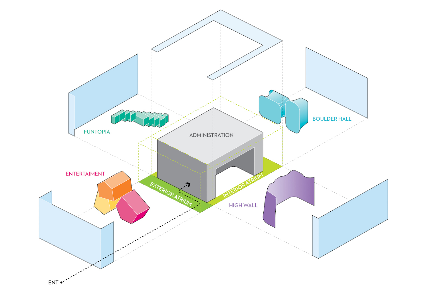
The Collider Activity Center is a multi-purpose sport center related to climbing. The center presents a diversity of images rather than one unified appearance because the building contains many different activities. We are interested in branding activities with different concepts, so we started thinking about how to express multiple activities through one design. We focused on how to convey the sorts of activities happening inside to those who are outside, through the shape of the building. The Center’s design includes two boxes – a glass box and a solid box inside it. Between the two boxes, there is an exterior atrium and three interior atriums – for entertainment, the high wall, the boulder hall, and Funtopia. Each atrium is physically and functionally interrelated with the exterior facade. Four facade of building offer different interpretations of aspects climbing – “gravity-free”, “flying planters”, “show room” and “hand prints”. We want to provide a high level contrast between the facades like billboards. Users will have an experience like visiting four buildings within a single building. In addition, while people are working out at the sports center, they will visually communicate with the outside of building at the same time. This interactivity between inside and outside will create a lively space.
Four Atriums and Facades
1. Gravity-free
The main entrance atrium is the first face of the building that people see as they approach the Center. People enter the building through a convex glass facade, an exterior atrium, and a main entrance. The design of the north atrium represents the theme of “gravity-free”. Climbing means working against gravity. Three programs (fitness, coffee shop and spa) intersect with the volume of the main building. These volumes float as if they were in a gravity-free atmosphere. At the front of the exterior atrium, the convex glass facade exaggerates this gravity-free condition, isolating the atrium from outside world as well as visually pixelating and distorting the view of the atrium. This creates a surreal space at the atrium. People feel like they are entering a fantasy or dream world when they pass through.
2. Flying Planters
The High Wall atrium is the most spacious area of the Collider Activity Center. People fight gravity in this space. Climbers try to go higher and escape far from the ground. The concept of the High Wall atrium is the romantic interpretation of escaping from the ground, and is called ‘Flying Planters’. In the front of High Wall atrium, planters hang from a structural cable. These planters are flying in the air, and diverse flowers and intertwined plants are growing toward the sky. This facade will create different moods according to planting and seasons. Inside of the atrium, people will feel convinced that they are in the forest. The planters are also varied in their size, color and shape. In addition, flying planters filter out direct sunlight like louvers. Its function will be maximized in summer as the facade will be filled with luxuriant vegetation.
3. Show Room
The South wall is dedicated to advertisements of Walltopia’s products. In the boulder hall, the products are distributed in a naturally manner, sometimes one is stacked on the other, sometimes it stands at the end of a staircase as if it is located at a cliff. Above them, huge show windows are floating, two cantilevered spaces used for office space and a multipurpose hall. From the outside, these two masses can be seen as a real display window of products because of the flat solid handrail shaped like a small boulder. The curtained interior space consists of a transparent and translucent back sheet that shows a unique and luxurious pattern. Conceptually, the pattern is a result of the compression of the three-dimensional space of the atrium onto a two-dimensional surface. At night, show windows make a delicate silhouette on the glass wall, similar to how Batman’s signal is projected in a cloud.
4. Hand Printing
The east facade consists of a glass curtain wall and beautiful lighting of hand-print shapes suspended on the wall. During the daytime, they provide beautiful shadows with the atrium, and at the end of the day it changes into brightly glowing objects floating on a sea of glass. Interestingly, the beauty of the east facade is not the material itself but rather something to do with the space. The basic concept comes from the movie “Charlie and the Chocolate Factory”, a story is about some events that happen during some kids visit to a chocolate factory, and the unexpected events and experience teaches lessons to both the children and adults. Funtopia is distributed across all of the floors next to the office space. The facade creates continuity between the different spatial layers through the use of transparent materials, and suggests that children have a visible connection and share space with the adult manufacturers in the office.

